Idea
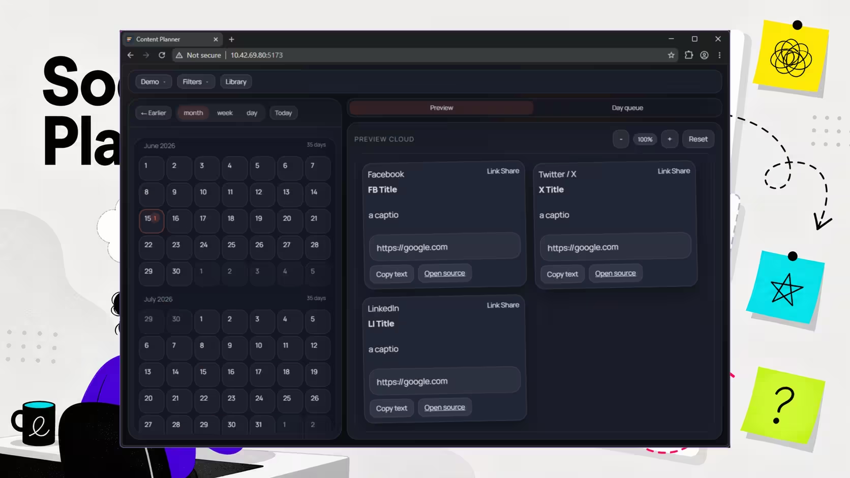
A lot of software starts with a noble little lie: "this will be quicker if we just build our own." That was the mood here. The plan was a DIY social content planner with a calendar view, a backlog for unscheduled drafts, and a loose post-it-style canvas for shaping ideas before they turned into scheduled posts.
The appeal made sense. Subscription tools can feel bloated when all you want is somewhere clear to plan content, move things around, and stop your ideas living in six tabs and a notebook that smells faintly of coffee. Building a smaller version felt reasonable. Slightly optimistic, but reasonable.
The real aim was less "replace every marketing platform on earth" and more "see what a lightweight planning tool needs before it becomes useful." That meant testing layout ideas, interaction patterns, and the boring bits of workflow that usually decide whether a tool gets opened again next week.
Useful for anyone weighing up a custom content workflow against an off-the-shelf planner.
Status
Working, but not adopted.
The planner did what it was meant to do. You could place content on a calendar, keep drafts off to one side, and sketch ideas on an infinite canvas without forcing everything into a rigid pipeline too early. From a build point of view, it held together well.
From a real-world point of view, it became more of a prototype for interface ideas than a daily tool. That is not a failure, exactly. Sometimes a project earns its keep by proving what is technically possible, then quietly losing the argument on practicality.
The problem was not that the app was broken. The problem was that existing tools already handle scheduling, posting, reminders, approvals, and platform connections without asking you to maintain any of it yourself. Very rude of them, really.
Problems Faced
The hardest part was not building the layout. It was verifying advanced interactions reliably in the browser with an agent involved.
Simple actions were fine. Click a button, fill a field, check a state change. Drag-and-drop gets messier fast, especially when cards can overlap, reorder visually, or respond differently depending on where the pointer crosses a boundary. Once you add an infinite canvas into the mix, the test surface gets slippery in a very literal way.
That made validation awkward. A human can look at a board and instantly tell whether a card landed in the right place. An agent needs a more explicit trail of evidence, and pointer-heavy interfaces do not always leave one behind. If your product depends on spatial interaction, browser verification becomes a design problem as much as a testing one.
The useful lesson there was straightforward: if an interface relies on drag precision, hover states, and layered movement, build observability into it early. Clear DOM state, visible drop zones, and machine-checkable position data save a lot of time later.
Techniques That Helped
The most useful detour was writing a SKILL.md that helped the agent generate AutoHotkey scripts for simulated mouse movement.
That was meant to support the planner, but it ended up being the more reusable outcome. By scripting repeatable cursor paths and drag behaviour, we had a better way to exercise interactions that were awkward to verify through normal browser automation alone. It was not elegant, but plenty of useful tooling starts life wearing an improvised hat.
The bigger takeaway was that support tooling can outlast the thing that inspired it. Building a helper for interaction testing gave us something portable: a way to test fiddly UI behaviour in future projects where standard click-and-assert flows are not enough.
For small teams, that is often a better return than the original app idea. If a side quest saves time twice, it stops being a side quest.
Lessons Learned
Building the planner was the easy part. Making a custom planner worth using every week was the harder job.
A calendar, draft list, and freeform planning canvas can absolutely be built as a tidy internal tool. The real threshold is operational value. Once you compare that tool with products that already handle publishing, account connections, reminders, and platform quirks, the question changes from "can we build it?" to "do we want to own it?"
That is usually the better question for a small business or solo operator. A custom tool makes sense when your workflow is genuinely unusual, your existing options are getting in the way, or the build itself teaches you something reusable. If none of those are true, the monthly subscription may be the cheaper bargain after all.
This one has been unused since creation, and that is fine. It still clarified where the real friction lives: not in arranging cards on a screen, but in keeping a planning system useful enough to beat habit, convenience, and tools that already do the admin for you.
If you are trying to work out whether a custom internal tool is worth building, we can help you think through the trade-offs before you end up maintaining a very clever extra chore.